Web Fundamentals
The foundation of web development — understand how the Web works before learning frontend, backend, databases, APIs, and deployment. Including HTML and CSS.

#Web Fundamentals#
🌐 Module 1: Web Fundamentals & Architecture
Everything on the web, from a static blog to a large-scale app, rests on a handful of core mechanics: URLs, DNS, HTTP/HTTPS, and the browser's rendering pipeline. This module explains each one and then ties them together by following a single request from keystroke to pixels.
Use this document two ways: read it top to bottom to learn, or jump to Section 7 for fast revision.
📑 Table of Contents
- Anatomy of a URL
- Domain Name System (DNS)
- HTTP & HTTPS
- How Web Browsers Work
- End-to-End: What Happens When You Press Enter
- Practice: See It Yourself
- Quick Revision Cheat Sheet
- Common Interview Questions
🎯 Learning Objectives
After this module you should be able to:
- Break any URL into its components and explain each part.
- Describe how a domain name becomes an IP address.
- Choose the right HTTP method and status code for an API action.
- Explain how HTTPS protects data in transit.
- Describe the Critical Rendering Path and why it affects performance.
- Narrate the full journey of a web request from memory.
1. Anatomy of a URL
A Uniform Resource Locator (URL) is the address that identifies and locates a resource on the internet.
  https://store.example.com:443/products/items?id=42&sort=asc#reviews
  └─┬─┘   └──────┬───────┘└┬┘└──────┬───────┘└──────┬──────┘└──┬──┘
 scheme     host/domain   port     path         query string  fragment
          (subdomain.domain.tld)                (parameters)  (anchor)
| Component | Example | Description |
|---|---|---|
| Scheme | https:// | The protocol used to fetch the resource (http, https, ftp, ...). |
| Subdomain | store | A level below the root domain; often separates sections or services (blog., api.). |
| Domain name | example.com | Human-readable name that maps to a server's IP address. |
| Port | :443 | Network endpoint on the server. Defaults: 80 for HTTP, 443 for HTTPS (usually omitted). |
| Path | /products/items | Location of the resource on the server. |
| Query string | ?id=42&sort=asc | Key-value pairs (&-separated) used for filtering, searching, or passing parameters. |
| Fragment | #reviews | Points to an element ID on the page. Handled only by the browser; it is never sent to the server. |
💡 Tip: The generic shape is
scheme://subdomain.domain.tld:port/path?query#fragment.
2. Domain Name System (DNS)
DNS is the "phonebook of the internet". It translates names like google.com into IP addresses like 142.250.190.46, because computers route traffic by IP, not by name.
2.1 Resolution flow
2.2 Step by step
- Cache check: Browser cache → OS cache → router cache → ISP cache. Any hit ends the lookup.
- Recursive resolver: On a miss, the request goes to a resolver (your ISP's, or a public one such as Cloudflare
1.1.1.1or Google8.8.8.8). It does the legwork for you. - Root nameserver (
.): Points the resolver to the correct TLD server (.com,.org,.io). - TLD nameserver: Points the resolver to the authoritative nameserver for the specific domain.
- Authoritative nameserver: Holds the real DNS records and returns the final IP. The resolver passes it to the browser and caches it.
⏱️ TTL (Time To Live): Each DNS record carries a TTL that says how long it may be cached. Low TTL = faster propagation of changes; high TTL = fewer lookups.
2.3 Common DNS record types
| Record | Purpose | Example |
|---|---|---|
| A | Domain → IPv4 address | example.com → 192.0.2.1 |
| AAAA | Domain → IPv6 address | example.com → 2001:db8::1 |
| CNAME | Alias from one name to another name | www.example.com → example.com |
| MX | Where to deliver email for the domain | mail.example.com (with priority) |
| TXT | Free-form text; used for SPF, DKIM, DMARC, domain verification | v=spf1 include:... |
| NS | Which nameservers are authoritative for the domain | ns1.provider.com |
3. HTTP & HTTPS
3.1 What is HTTP?
HyperText Transfer Protocol is an application-layer protocol for transferring web resources. It follows a client-server model and is stateless: each request is independent, and the server keeps no memory of earlier ones. (State is added on top using cookies, sessions, and tokens.)
A request/response pair looks like this:
GET /products/items?id=42 HTTP/1.1
Host: store.example.com
Accept: text/html
HTTP/1.1 200 OK
Content-Type: text/html; charset=utf-8
Cache-Control: max-age=3600

<!DOCTYPE html>...
3.2 HTTP methods
| Method | Purpose | Safe? | Idempotent? |
|---|---|---|---|
GET | Retrieve a resource | ✅ | ✅ |
HEAD | Same as GET but headers only, no body | ✅ | ✅ |
OPTIONS | Ask which methods are allowed (used in CORS preflight) | ✅ | ✅ |
POST | Submit data / create a new resource | ❌ | ❌ |
PUT | Replace a resource entirely (or create it if missing) | ❌ | ✅ |
PATCH | Partially modify a resource | ❌ | ❌ (not guaranteed) |
DELETE | Remove a resource | ❌ | ✅ |
- Safe = does not change server state.
- Idempotent = repeating the request N times leaves the server in the same state as sending it once. Example:
DELETE /users/5twice still leaves user 5 deleted, whereasPOST /orderstwice may create two orders.
3.3 HTTP status codes
| Range | Category | Common codes |
|---|---|---|
| 1xx | Informational | 100 Continue, 101 Switching Protocols |
| 2xx | Success | 200 OK, 201 Created, 204 No Content |
| 3xx | Redirection | 301 Moved Permanently, 302 Found, 304 Not Modified |
| 4xx | Client error | 400 Bad Request, 401 Unauthorized, 403 Forbidden, 404 Not Found, 429 Too Many Requests |
| 5xx | Server error | 500 Internal Server Error, 502 Bad Gateway, 503 Service Unavailable, 504 Gateway Timeout |
⚠️ Often confused
401= "I don't know who you are" (not authenticated).403= "I know who you are, but you can't do this" (not authorized).301= permanent move (browsers and search engines cache it).302= temporary.502= a gateway/proxy got a bad response from the upstream server.504= the upstream server timed out.
3.4 HTTP vs HTTPS
HTTPS = HTTP over TLS. TLS (the successor to SSL) adds three guarantees:
| Guarantee | Meaning |
|---|---|
| Confidentiality | Data is encrypted; eavesdroppers see gibberish. |
| Integrity | Data can't be modified in transit without detection. |
| Authentication | The certificate proves you're talking to the real server. |
HTTP :  [ HTTP data ] ─────────────────────────────► TCP (plaintext)
HTTPS:  [ HTTP data ] ──► [ TLS encryption ] ──────► TCP (encrypted)
TLS uses both kinds of encryption, each for what it does best:
| Type | Used for | Why |
|---|---|---|
| Asymmetric (public/private key pair) | The handshake: authenticating the server and agreeing on a shared key | Safe key exchange over an open network, but slow |
| Symmetric (one shared key) | The actual data transfer | Very fast |
3.5 Evolution of HTTP
| Version | Transport | Key features | Limitation it addresses |
|---|---|---|---|
| HTTP/1.1 | TCP | Persistent connections (keep-alive) | Suffers from Head-of-Line (HoL) blocking: responses on a connection must be returned in order |
| HTTP/2 | TCP | Multiplexing (many requests over one connection), header compression (HPACK), binary framing | Fixes HTTP-level HoL blocking, but TCP-level HoL blocking remains |
| HTTP/3 | QUIC over UDP | Independent streams, faster connection setup (combines transport + TLS 1.3 handshake), better on lossy/mobile networks | Eliminates TCP-level HoL blocking |
📝 HTTP/2 also defined Server Push, but it saw little adoption and major browsers (e.g. Chrome) have removed support, so treat it as a historical feature.
4. How Web Browsers Work
A browser turns HTML, CSS, JavaScript, and assets into an interactive page.
4.1 Main components
| Component | Role | Examples |
|---|---|---|
| User interface | Address bar, tabs, back/forward, bookmarks | |
| Browser engine | Coordinates between the UI and the rendering engine | |
| Rendering engine | Parses HTML/CSS and paints the page | Blink (Chrome, Edge), Gecko (Firefox), WebKit (Safari) |
| JavaScript engine | Parses and executes JS | V8 (Chrome), SpiderMonkey (Firefox), JavaScriptCore (Safari) |
| Networking layer | DNS lookups, HTTP/HTTPS, sockets | |
| Data storage | Persistent client-side data | Cookies, LocalStorage, SessionStorage, IndexedDB, Cache |
4.2 The Critical Rendering Path (CRP)
The CRP is the sequence of steps from raw bytes to pixels on screen.
| Step | What happens |
|---|---|
| 1. DOM construction | HTML is parsed into tokens, then into the Document Object Model tree. |
| 2. CSSOM construction | CSS is parsed into the CSS Object Model tree. |
| 3. Render tree | DOM + CSSOM are combined. Contains only visible nodes (display: none elements are excluded). |
| 4. Layout (reflow) | Computes the exact size and position of every node in the viewport. |
| 5. Paint | Fills in pixels: text, colors, borders, images, shadows. |
| 6. Composite | Draws layers separately and merges them in the right order, so scrolling and animations stay smooth. |
4.3 What blocks rendering?
- CSS is render-blocking: the browser won't paint until the CSSOM is ready.
- Synchronous JavaScript is parser-blocking: a plain
<script>pauses HTML parsing while it downloads and runs (it may also need the CSSOM first).
<script src="app.js"></script>        <!-- blocks HTML parsing -->
<script src="app.js" defer></script>  <!-- downloads in parallel, runs after parsing, keeps order -->
<script src="app.js" async></script>  <!-- downloads in parallel, runs as soon as ready, no order -->
💡 Performance rule of thumb: keep critical CSS small, load non-essential JS with
defer/async, and avoid changes that force repeated layout (reflow).
5. End-to-End: What Happens When You Press Enter
You type https://example.com and press Enter. Here is the whole journey.
Detailed sequence
- URL parsing & HSTS check: The browser validates the scheme and domain. If the site is on the HSTS (HTTP Strict Transport Security) list, it upgrades to HTTPS automatically.
- DNS resolution:
example.comis resolved to an IP (e.g.93.184.216.34). See Section 2. - TCP 3-way handshake: Establishes a reliable connection.
SYN: client → server ("let's talk")SYN-ACK: server → client ("OK, let's talk")ACK: client → server ("connected")
- TLS handshake (HTTPS):
- Client and server agree on a cipher suite.
- Server sends its certificate; the client validates it against trusted Certificate Authorities (CAs).
- A shared session key is established using asymmetric cryptography; all further traffic uses fast symmetric encryption.
- HTTP request: The browser sends the method, path, headers (and body, if any).
- Server processing & response: The server runs its logic, queries a database if needed, and returns a status code, headers, and body.
- Rendering & asset retrieval: The browser builds the DOM, discovers extra resources (
<link>,<script>,<img>), fetches them concurrently, and runs the Critical Rendering Path to paint the page.
📝 With HTTP/3, steps 3 and 4 collapse: QUIC (over UDP) merges the transport and TLS 1.3 handshakes, so connections start faster.
6. Practice: See It Yourself
Reading is good; observing is better.
Browser DevTools (F12)
- Network tab: reload a page and click any request to see its method, status code, headers, and timing breakdown (DNS, connect, TLS, waiting, download).
- Elements tab: inspect the live DOM and the computed CSS for any node.
- Performance tab: record a page load and look for layout/paint events.
Command line
# Look up DNS records
nslookup example.com
dig example.com A
dig example.com MX

# See request/response headers and the HTTP version
curl -I https://example.com
curl -v https://example.com          # also shows the TLS handshake
curl --http2 -I https://example.com
Exercises
- Take a URL from a site you use and label every component.
- Use
digto find a domain'sNSandTXTrecords. - In the Network tab, find one
304 Not Modifiedresponse (reload twice) and explain why it happened. - Find a request that returns a redirect (
301/302) and follow theLocationheader.
7. Quick Revision Cheat Sheet
URL
scheme://subdomain.domain.tld:port/path?query#fragment (the fragment stays in the browser)
DNS resolution order Browser cache → OS cache → Resolver → Root → TLD → Authoritative server
HTTP methods
GET | POST | PUT | PATCH | DELETE |
|---|---|---|---|---|
| Read | Create | Replace | Modify | Remove |
Status code shortcuts
| Code | Meaning | Code | Meaning |
|---|---|---|---|
200 | Success | 401 | Unauthenticated |
201 | Created | 403 | Forbidden |
301 | Permanent redirect | 404 | Not found |
304 | Use cached copy | 500 | Server crash |
400 | Invalid request | 502 / 503 | Bad gateway / unavailable |
HTTPS HTTP over TLS: asymmetric encryption for the handshake, symmetric encryption for data.
HTTP versions 1.1 (TCP, persistent) → 2 (TCP, multiplexing) → 3 (QUIC/UDP)
Critical Rendering Path
HTML → DOM + CSS → CSSOM → Render Tree → Layout → Paint → Composite
Request journey in one line Parse/HSTS → DNS → TCP → TLS → HTTP request → Server response → Render
8. Common Interview Questions
1. What happens when you type a URL into the browser and press Enter?
Walk through Section 5: URL parse and HSTS → DNS → TCP handshake → TLS handshake → HTTP request → server response → browser rendering (DOM, CSSOM, render tree, layout, paint, composite).
2. What is the difference between PUT and PATCH?
PUT replaces the whole resource with the payload (idempotent). PATCH applies a partial update, changing only the fields sent.
3. Why does HTTPS use both symmetric and asymmetric encryption?
Asymmetric encryption safely establishes trust and a shared secret over an untrusted network but is slow. Symmetric encryption is fast, so it handles the bulk data once both sides share the key.
4. What does "stateless" mean in HTTP?
Each request is self-contained; the server doesn't remember previous requests. Applications add state with cookies, sessions, or tokens.
5. What's the difference between 401 and 403?
401: the client isn't authenticated (missing or invalid credentials). 403: the client is authenticated but lacks permission.
6. What is Head-of-Line blocking, and how do HTTP/2 and HTTP/3 address it?
It happens when one slow or lost item blocks everything queued behind it. HTTP/2 multiplexes requests over one connection (fixing it at the HTTP level), and HTTP/3 uses QUIC over UDP so a lost packet only stalls its own stream (fixing it at the transport level).
7. Why does CSS block rendering?
The browser needs the full CSSOM to know how nodes look and where they go; painting without it would cause a flash of unstyled content and wasted work.
#HTML5#
📘 HTML: Complete Revision Guide
A structured, interview- and OA-ready guide to HTML, from fundamentals to HTML5. The four areas that matter most in frontend interviews are marked with ⭐: semantic HTML, forms, accessibility, and SEO basics.
How to use it: read top to bottom to learn, or jump to the Cheat Sheet and Interview Questions for fast revision.
📑 Table of Contents
- Foundations
- Content Elements: Text, Links, Media, Lists, Tables
- ⭐ Semantic HTML
- ⭐ Forms
- ⭐ Accessibility
- ⭐ SEO Basics
- Scripts & Performance
- Browser Concepts: DOM, Rendering, Storage, Modern Elements
- Common Mistakes & Best Practices
- Practical Example
- Quick Cheat Sheet
- Interview Questions
- Final Checklist
🎯 Learning Objectives
After this guide you should be able to:
- Write a valid, well-structured HTML5 document from memory.
- Pick the right semantic element instead of a generic
<div>. - Build an accessible, validated form with proper labels.
- Apply accessibility and SEO basics directly in markup.
- Explain
asyncvsdefer, the DOM, and browser storage options. - Answer the common HTML interview questions confidently.
1. Foundations
1.1 What is HTML?
HTML (HyperText Markup Language) is the standard markup language for structuring web content. It defines headings, paragraphs, links, media, lists, tables, forms, semantic structure, and metadata.
HTML is not a programming language: it has no loops, conditions, or functions. It describes structure, not logic.
| Technology | Role | Analogy |
|---|---|---|
| HTML | Structure and meaning | Skeleton |
| CSS | Presentation / styling | Appearance |
| JavaScript | Behavior / logic | Muscles / nervous system |
1.2 Basic document structure
<!DOCTYPE html>
<html lang="en">
<head>
    <meta charset="UTF-8">
    <meta name="viewport" content="width=device-width, initial-scale=1.0">
    <title>My Page</title>
</head>
<body>
    <h1>Hello World</h1>
    <p>This is my first webpage.</p>
</body>
</html>
| Part | Purpose |
|---|---|
<!DOCTYPE html> | Tells the browser to use standards mode (HTML5). It is a declaration, not an element. |
<html lang="en"> | Root element. lang sets the document language (important for screen readers, translation, SEO). |
<head> | Metadata and resources, not shown as page content: <title>, <meta>, <link>, <style>, <script>. |
<body> | All visible page content. |
1.3 Tags, elements, and attributes
<a href="https://example.com">Visit</a>
| Term | Meaning | In the example |
|---|---|---|
| Tag | The markup syntax | <a> and </a> |
| Element | Opening tag + content + closing tag | The whole line |
| Attribute | Extra configuration as name="value" | href="https://example.com" |
1.4 Nesting
Elements can be nested, but they must close in the reverse order they were opened.
<!-- ✅ Correct -->
<p><strong>Hello</strong></p>

<!-- ❌ Incorrect -->
<p><strong>Hello</p></strong>
1.5 Void (empty) elements
Void elements have no content and no closing tag: <img>, <br>, <hr>, <input>, <meta>, <link>.
<img src="photo.jpg" alt="Profile photo">
1.6 Comments
<!-- This is a comment -->
Useful for notes and documentation. Never put passwords, API keys, or secrets in comments; users can view the source.
1.7 HTML entities
Entities represent reserved or special characters.
| Entity | Character | Entity | Character |
|---|---|---|---|
< | < | " | " |
> | > | | non-breaking space |
& | & | © | © |
<p>Use <h1> for a main heading.</p>
1.8 Character encoding
<meta charset="UTF-8">
UTF-8 supports virtually all characters and is the standard for modern sites. Put it early in <head>.
1.9 Global attributes
Attributes that work on (almost) any element:
| Attribute | Purpose |
|---|---|
id | Unique identifier within the document |
class | Reusable group name (for CSS/JS) |
title | Advisory tooltip text |
style | Inline CSS (avoid in production) |
hidden | Hides the element |
lang / dir | Language / text direction |
tabindex | Keyboard focus order |
data-* | Custom data (see 8.6) |
aria-* | Accessibility semantics (see Section 5) |
id vs class: id = unique identity (one per page, also used as #fragment target); class = reusable grouping/style hook.
1.10 Block vs inline elements
| Type | Typical behavior | Examples |
|---|---|---|
| Block | Starts on a new line, takes full width | div, p, h1, section, article |
| Inline | Flows within text, takes only needed width | span, a, strong, em |
💡 These are default rendering behaviors, controlled by CSS
display.span { display: block; }is valid. Block/inline is a layout concept, not a permanent HTML property.
2. Content Elements: Text, Links, Media, Lists, Tables
2.1 Headings
Six levels, <h1> (highest) to <h6>.
<h1>Web Development</h1>
  <h2>HTML</h2>
    <h3>Forms</h3>
    <h3>Tables</h3>
  <h2>CSS</h2>
Rules
- Headings express document hierarchy, not font size. Style size with CSS.
- Don't skip levels (e.g.
h2→h4). - Convention: one
<h1>per page describing its main topic.
2.2 Paragraphs, line breaks, thematic breaks
<p>This is a paragraph.</p>
<p>Hello<br>World</p>   <!-- <br>: meaningful line break (poems, addresses) -->
<hr>                    <!-- <hr>: thematic break between topics -->
Don't use <br> for spacing; use CSS margin/padding.
2.3 Text formatting elements
| Element | Meaning | Example |
|---|---|---|
<strong> | Strong importance (semantic) | <strong>Warning</strong> |
<b> | Stylistic attention, no extra importance | <b>keyword</b> |
<em> | Emphasis (semantic; can change meaning) | I <em>love</em> HTML |
<i> | Alternate voice/mood, technical term | <i>de facto</i> |
<mark> | Highlighted / relevant text | <mark>match</mark> |
<small> | Side comments, fine print | <small>T&C apply</small> |
<del> / <ins> | Deleted / inserted content | <del>₹999</del> <ins>₹799</ins> |
<sub> / <sup> | Subscript / superscript | H<sub>2</sub>O, x<sup>2</sup> |
<code>, <pre>, <kbd> | Code, preformatted text, keyboard input | <code>npm install</code> |
<abbr>, <blockquote>, <q>, <cite> | Abbreviation, quotations, source | <abbr title="HyperText Markup Language">HTML</abbr> |
Key distinction:
<strong>/<em>carry meaning (screen readers may change tone);<b>/<i>are only stylistic.
2.4 Links
<a href="https://example.com">External</a>
<a href="/about">Internal page</a>
<a href="#contact">Same-page section</a>
<a href="mailto:test@example.com">Email</a>
<a href="tel:+911234567890">Call</a>
Opening in a new tab
<a href="https://example.com" target="_blank" rel="noopener noreferrer">Open</a>
rel value | Why |
|---|---|
noopener | Stops the new page from accessing your page via window.opener (tab-nabbing protection) |
noreferrer | Also stops the browser sending the Referer header (and implies noopener) |
📝 Modern browsers apply
noopenertotarget="_blank"by default, but writing it explicitly is still good practice.
Good link text: write descriptive text ("Read the pricing guide"), not "click here". It helps accessibility and SEO.
2.5 Images
<img
    src="profile.jpg"
    alt="Profile photograph"
    width="300"
    height="300"
    loading="lazy"
>
| Attribute | Purpose |
|---|---|
src | Image URL |
alt | Text alternative (screen readers, broken images, search engines) |
width / height | Reserve space to prevent layout shift (CLS) |
loading="lazy" | Defer off-screen images (don't lazy-load the main above-the-fold image) |
Writing alt text
- Informative image → describe its purpose/content.
- Decorative image → empty alt:
alt=""(screen readers skip it). - Image inside a link → describe the link destination/action.
2.6 Responsive images
<img
    src="small.jpg"
    srcset="small.jpg 480w, medium.jpg 800w, large.jpg 1200w"
    sizes="(max-width: 600px) 480px, 800px"
    alt="Mountain landscape"
>
srcsetlists candidate files with their widths.sizestells the browser how wide the image will display, so it can pick a suitable file.<picture>with<source>is used for art direction or serving modern formats (WebP/AVIF) with a fallback.
<picture>
    <source srcset="photo.avif" type="image/avif">
    <source srcset="photo.webp" type="image/webp">
    <img src="photo.jpg" alt="Sunset over the lake">
</picture>
2.7 Audio and video
<audio controls>
    <source src="audio.mp3" type="audio/mpeg">
    Your browser does not support audio.
</audio>

<video controls width="640" poster="thumb.jpg">
    <source src="video.mp4" type="video/mp4">
    <track kind="captions" src="captions.vtt" srclang="en" label="English">
    Your browser does not support video.
</video>
Common attributes: controls, autoplay, loop, muted, preload, plus poster, width, height (video).
Browsers usually block autoplay unless the media is muted. Provide captions (
<track>) for accessibility.
2.8 Lists
<ul>  <!-- unordered: bullets -->
    <li>HTML</li>
    <li>CSS</li>
</ul>

<ol start="5">  <!-- ordered: numbers; also supports reversed and type -->
    <li>Five</li>
    <li>Six</li>
</ol>

<dl>  <!-- description list: term/definition pairs -->
    <dt>HTML</dt>
    <dd>Markup language for structuring web pages.</dd>
</dl>
Use lists for navigation menus too: a <nav> containing a <ul> is the standard pattern.
2.9 Tables
Tables are for tabular data, not page layout.
<table>
    <caption>Student marks</caption>
    <thead>
        <tr>
            <th scope="col">Name</th>
            <th scope="col">Marks</th>
        </tr>
    </thead>
    <tbody>
        <tr>
            <td>Ritesh</td>
            <td>95</td>
        </tr>
    </tbody>
    <tfoot>
        <tr>
            <td>Average</td>
            <td>95</td>
        </tr>
    </tfoot>
</table>
| Element | Meaning |
|---|---|
<caption> | Table title (helps accessibility) |
<thead> / <tbody> / <tfoot> | Header / main data / summary sections |
<tr> | Row |
<th> | Header cell (use scope="col" or scope="row" for accessibility) |
<td> | Data cell |
colspan / rowspan | One cell spans multiple columns / rows |
<td colspan="2">Total</td>   <!-- spans 2 columns -->
<td rowspan="2">ECE</td>     <!-- spans 2 rows -->
3. ⭐ Semantic HTML
Semantic HTML uses elements whose names describe their meaning, so browsers, search engines, and assistive technology understand the page structure.
<!-- ❌ Meaning only in class names -->
<div class="header"></div>
<div class="navigation"></div>
<div class="main"></div>

<!-- ✅ Meaning built into the elements -->
<header></header>
<nav></nav>
<main></main>
3.1 Why it matters
| Benefit | How |
|---|---|
| Accessibility | Screen readers expose landmarks (nav, main) so users can jump straight to them |
| SEO | Search engines better understand page structure and content importance |
| Maintainability | Markup is self-documenting |
| Built-in behavior | Native elements bring keyboard support and default semantics for free |
3.2 Key semantic elements
| Element | Purpose | Notes |
|---|---|---|
<header> | Introductory content for a page or section | Can be used inside <article>/<section> too |
<nav> | Major navigation links | Label multiple navs with aria-label |
<main> | Primary content of the page | One visible <main> per page; not inside header/footer/nav/aside |
<section> | Thematic grouping of content | Should normally have a heading |
<article> | Self-contained, independently distributable content | Blog post, news story, forum post, product review |
<aside> | Tangentially related content | Sidebar, related links, pull quotes |
<footer> | Footer for a page or section | Copyright, contact, related links |
<figure> / <figcaption> | Self-contained media + caption | Images, diagrams, code listings |
<address> | Contact information for the nearest article/page | Not for arbitrary postal addresses |
<time> | Machine-readable date/time | <time datetime="2026-10-02">October 2, 2026</time> |
3.3 section vs article vs div
| Element | Use when |
|---|---|
<article> | The content makes sense on its own (could be syndicated or reused) |
<section> | Content is a themed part of a larger whole and has a heading |
<div> | There is no more meaningful element; purely a styling/scripting hook |
3.4 div vs span
<div> | <span> |
|---|---|
| Generic block container | Generic inline container |
| Groups larger chunks of content | Wraps part of a line of text |
| Starts on a new line (by default) | Doesn't break the line (by default) |
<p>Hello <span class="highlight">world</span></p>
Both carry no semantic meaning; reach for them last.
3.5 Typical page layout
<body>
<header>
<h1>Site Name</h1>
<nav aria-label="Main navigation">…</nav>
</header>
<main>
<article>
<h2>Post title</h2>
<p>…</p>
</article>
<aside>Related posts</aside>
</main>
<footer>
<p>© 2026 Site Name</p>
</footer>
</body>
4. ⭐ Forms
Forms collect user input and send it to a server (or hand it to JavaScript).
<form action="/submit" method="post">
    <label for="name">Name</label>
    <input id="name" name="name" type="text" required>

    <button type="submit">Submit</button>
</form>
<form> attribute | Purpose |
|---|---|
action | URL that receives the data |
method | get or post |
enctype | Encoding; use multipart/form-data for file uploads |
autocomplete | Enable/disable browser autofill |
novalidate | Disable built-in validation |
4.1 GET vs POST
GET | POST | |
|---|---|---|
| Data location | In the URL query string (/search?q=html) | In the request body |
| Typical use | Search, filters, read-only queries | Creating data, login, state-changing actions |
| Bookmarkable / cacheable | Yes | No |
| Visible in history/logs | Yes (don't send secrets!) | Not in the URL |
⚠️ POST is not automatically secure. Use HTTPS to protect data in transit.
4.2 Labels
<!-- Explicit: for matches the input's id -->
<label for="email">Email</label>
<input id="email" type="email">

<!-- Implicit: wrap the input -->
<label>Email <input type="email"></label>
Labels give the control an accessible name, enlarge the click target (clicking the label focuses the input), and are essential for screen readers. Placeholders are not a substitute for labels: they vanish on input and have poor contrast.
4.3 Input types
| Type | Use |
|---|---|
text, search, password | Free text, search box, masked text |
email, url, tel | Validation/keyboard hints for emails, URLs, phone numbers |
number, range | Numeric entry / slider |
date, time, datetime-local | Native pickers |
checkbox, radio | Multi/single choice |
file | File upload |
color | Color picker |
hidden | Value sent but not displayed |
Using the right type gives free validation, mobile keyboards, and pickers.
4.4 Important attributes
<input
    type="text"
    id="username"
    name="username"
    placeholder="Enter username"
    required
    minlength="3"
    maxlength="20"
    autocomplete="username"
>
| Attribute | Purpose |
|---|---|
name | Key sent to the server; a control without name is not submitted |
id | Unique identifier (links to <label for>) |
value | Initial/current value |
placeholder | Hint text (not a label) |
required | Must be filled |
min, max, step | Numeric/date limits |
minlength, maxlength | Text length limits |
pattern | Regex the value must match |
autocomplete | Autofill hint (email, username, current-password, ...) |
checked, selected | Pre-selected checkbox/radio / option |
disabled, readonly | See below |
4.5 disabled vs readonly
disabled | readonly | |
|---|---|---|
| Can the user edit it? | No | No |
| Can it receive focus? | No | Yes |
| Submitted with the form? | No | Yes |
4.6 Checkbox vs radio
<!-- Checkbox: multiple selections allowed -->
<input type="checkbox" name="skill" value="html">
<input type="checkbox" name="skill" value="css">

<!-- Radio: one choice; same name = one group -->
<input type="radio" name="level" value="beginner">
<input type="radio" name="level" value="advanced">
Group related controls with <fieldset> and <legend>:
<fieldset>
    <legend>Experience level</legend>
    <label><input type="radio" name="level" value="beginner"> Beginner</label>
    <label><input type="radio" name="level" value="advanced"> Advanced</label>
</fieldset>
4.7 Select, option, and textarea
<label for="city">City</label>
<select id="city" name="city">
    <option value="">Choose a city</option>
    <option value="bhopal">Bhopal</option>
    <option value="indore">Indore</option>
</select>

<label for="message">Message</label>
<textarea id="message" name="message" rows="5" cols="30"></textarea>
<optgroup> groups options; <datalist> offers autocomplete suggestions for an <input>.
4.8 Button types
<button type="submit">Submit</button>
<button type="reset">Reset</button>
<button type="button">Does nothing by default</button>
⚠️ Inside a form, a
<button>withouttypedefaults tosubmit. In JS-heavy apps, writetype="button"for buttons that shouldn't submit the form.
4.9 Built-in validation
<input type="email" required>
<input type="text" pattern="[A-Za-z]{3,20}" title="3 to 20 letters" required>
Attributes: required, min, max, minlength, maxlength, pattern, and type itself. Browsers show native error messages and block submission when invalid.
🔒 Client-side validation is a UX feature, not security. It can be bypassed in seconds, so always validate on the server too.
4.10 Accessible error messages
<label for="email">Email</label>
<input id="email" type="email" aria-describedby="email-error" aria-invalid="true">
<p id="email-error">Enter a valid email address, like name@example.com.</p>
aria-describedby links the message to the field so screen readers announce it together.
5. ⭐ Accessibility
Accessibility (a11y) means making sites usable by people with different abilities, including those using screen readers, keyboards only, voice control, or magnification.
5.1 Core practices
- Use semantic HTML and a logical heading hierarchy.
- Associate every form control with a
<label>. - Give informative images useful
alttext (alt=""for decorative ones). - Make everything operable with the keyboard, with a visible focus indicator.
- Use buttons for actions and links for navigation.
- Set the page
lang, give pages a descriptive<title>. - Provide captions/transcripts for media.
- Ensure sufficient color contrast; never rely on color alone.
- Use ARIA only when native HTML isn't enough.
5.2 Buttons vs links
| Use | For | Example |
|---|---|---|
Link <a href> | Navigation (goes somewhere) | <a href="/profile">Profile</a> |
Button <button> | Actions (does something) | <button type="button">Delete</button> |
<!-- ❌ A div is not an interactive control: no keyboard focus, no role -->
<div onclick="deleteItem()">Delete</div>

<!-- ✅ Native button: focusable, Enter/Space work, announced as a button -->
<button type="button" onclick="deleteItem()">Delete</button>
5.3 Keyboard accessibility
Native controls (<button>, <a href>, <input>, <select>, <textarea>) give you focus and key handling for free. Avoid rebuilding them from <div>s.
tabindex="0": adds an element to the natural tab order (rarely needed).tabindex="-1": focusable by script only.- Avoid positive
tabindexvalues; they break natural order.
Skip link: lets keyboard users bypass repeated navigation.
<body>
    <a href="#main" class="skip-link">Skip to main content</a>
    <header>…</header>
    <main id="main">…</main>
</body>
5.4 ARIA
ARIA (Accessible Rich Internet Applications) attributes add semantics when native HTML can't express them.
<button aria-label="Close menu">X</button>
<div aria-live="polite">Saved successfully.</div>
<button aria-expanded="false" aria-controls="menu">Menu</button>
| Attribute | Purpose |
|---|---|
aria-label | Gives an element an accessible name |
aria-labelledby | Names an element using another element's text |
aria-describedby | Links extra description (hints, errors) |
aria-hidden="true" | Hides content from assistive tech |
aria-expanded | Whether a collapsible region is open |
aria-controls | Which element this control operates |
aria-live | Announces dynamic updates (polite, assertive) |
aria-current | Marks the current item (page, step) |
First rule of ARIA: prefer native HTML. <button>Menu</button> is better than <div role="button" tabindex="0">Menu</div>, which would also need manual keyboard handling. Bad ARIA is worse than no ARIA.
6. ⭐ SEO Basics
HTML gives search engines the signals they use to understand and display your page.
6.1 The essentials
<head>
    <meta charset="UTF-8">
    <meta name="viewport" content="width=device-width, initial-scale=1.0">

    <title>HTML Revision Notes | Complete Guide</title>
    <meta name="description" content="Complete HTML revision notes covering semantics, forms, accessibility and SEO.">

    <link rel="canonical" href="https://example.com/html-notes">
    <link rel="icon" href="/favicon.ico">
</head>
| Item | Why it matters |
|---|---|
<title> | Shown in the tab, bookmarks, and search results; unique and descriptive per page |
meta description | Often used as the search-result snippet (a summary, not a ranking factor) |
canonical link | Tells search engines which URL is preferred when content is duplicated |
lang attribute | Language signal for search engines and assistive tech |
| Headings | Clear hierarchy communicates content structure |
| Semantic HTML | Helps crawlers understand page regions |
| Descriptive link text | Context for what the target page is about |
Image alt text | Lets image search understand images |
| Crawlable links | Use real <a href> links, not JS-only click handlers |
6.2 Robots meta
<meta name="robots" content="noindex, nofollow">
index, follow is the default, so writing it is redundant. Use this tag mainly to block indexing (noindex) for pages like thank-you or admin pages.
6.3 Social sharing (Open Graph)
Controls the preview card when a link is shared.
<meta property="og:title" content="HTML Revision Notes">
<meta property="og:description" content="Complete HTML revision guide.">
<meta property="og:image" content="https://example.com/preview.png">
<meta property="og:url" content="https://example.com/html-notes">
6.4 Structured data (JSON-LD, bonus)
Machine-readable context that can enable rich results.
<script type="application/ld+json">
{
  "@context": "https://schema.org",
  "@type": "Article",
  "headline": "HTML Revision Notes",
  "datePublished": "2026-10-02"
}
</script>
6.5 Avoid
- Keyword stuffing and misleading titles/descriptions.
- Hidden text intended only for crawlers.
- Obsolete tags such as
<meta name="keywords">(ignored by major search engines).
🔗 SEO and accessibility overlap heavily: good headings, alt text, semantic structure, and descriptive links help both.
7. Scripts & Performance
7.1 Stylesheets and scripts
<link rel="stylesheet" href="styles.css">
<script src="app.js" defer></script>
CSS in <head>; scripts usually with defer (or at the end of <body>).
7.2 async vs defer
By default, a plain <script src> blocks HTML parsing while it downloads and runs.
Plain <script> | async | defer | |
|---|---|---|---|
| Download | Blocks parsing | In parallel | In parallel |
| Execution | Immediately (blocks parsing) | As soon as downloaded (may pause parsing) | After HTML parsing finishes |
| Order preserved? | Yes | No | Yes |
| Best for | Rare cases | Independent scripts (analytics, ads) | App code that needs the DOM, or ordered dependencies |
<script src="analytics.js" async></script>
<script src="app.js" defer></script>
7.3 HTML performance habits
- Set
widthandheighton images (prevents layout shift). - Use
loading="lazy"for below-the-fold images; use responsive images. - Load non-critical JS with
defer/async. - Avoid unnecessary third-party resources and deeply nested markup.
8. Browser Concepts: DOM, Rendering, Storage, Modern Elements
8.1 The DOM
The browser parses HTML into the DOM (Document Object Model), a tree of objects that JavaScript can read and modify.
<body>
    <h1>Hello</h1>
    <p>World</p>
</body>
Document
└── html
    └── body
        ├── h1
        │   └── "Hello"
        └── p
            └── "World"
document.querySelector("h1").textContent = "Hi";
8.2 From HTML to pixels
HTML → DOM ─┐
            ├→ Render Tree → Layout → Paint → Composite
CSS → CSSOM ┘
JavaScript can change the DOM and trigger more layout/paint work, which is why DOM manipulation affects performance.
8.3 Web storage and cookies
Storage APIs belong to the broader Web Platform, not HTML itself, but they're a staple of frontend interviews.
// localStorage: persists until cleared
localStorage.setItem("theme", "dark");
const theme = localStorage.getItem("theme");
localStorage.removeItem("theme");

// Objects must be serialized (storage holds strings only)
localStorage.setItem("user", JSON.stringify({ name: "Ritesh" }));
const user = JSON.parse(localStorage.getItem("user"));

// sessionStorage: same API, cleared when the tab/session ends
sessionStorage.setItem("step", "2");
| Feature | localStorage | sessionStorage | Cookies |
|---|---|---|---|
| Lifetime | Until cleared | Tab/session | Configurable (Expires / Max-Age) |
| Sent with HTTP requests | No | No | Yes, automatically (when applicable) |
| JS access | Yes | Yes | Yes, unless HttpOnly |
| Typical capacity | ~5 MB | ~5 MB | ~4 KB each |
| API | Synchronous | Synchronous | document.cookie / Set-Cookie header |
| Common use | Preferences, cached data | Temporary UI state | Sessions, auth-related state |
Cookie security attributes
| Attribute | Effect |
|---|---|
HttpOnly | JavaScript cannot read the cookie (mitigates XSS theft) |
Secure | Sent only over HTTPS |
SameSite | Strict / Lax / None: controls cross-site sending (CSRF defense) |
Domain, Path | Which hosts/paths receive the cookie |
Max-Age, Expires | Lifetime |
⚠️ Avoid storing long-lived secrets (auth tokens) in
localStorage: any XSS bug can read it.
8.4 <iframe>
Embeds another page (a browsing context).
<iframe src="https://example.com" title="Example website" sandbox></iframe>
Always add a title (accessibility). sandbox restricts what embedded content may do. Only embed sources you trust.
8.5 <details> / <summary>
Native expandable content, with no JavaScript needed.
<details>
    <summary>What is HTML?</summary>
    <p>HTML structures web documents.</p>
</details>
8.6 Modern HTML elements
<dialog>: native modal.
<dialog id="myDialog"><p>Hello!</p></dialog>
<script>
    myDialog.showModal();  // opens as a modal
    myDialog.close();
</script>
<template>: inert markup that isn't rendered until cloned.
<template id="card">
    <article><h2></h2><p></p></article>
</template>
data-* attributes: custom data attached to elements.
<button data-product-id="123" data-category="electronics">View</button>
<script>
    const btn = document.querySelector("button");
    console.log(btn.dataset.productId);   // "123"  (kebab-case → camelCase)
    console.log(btn.dataset.category);    // "electronics"
</script>
9. Common Mistakes & Best Practices
9.1 Common mistakes
| ❌ Mistake | ✅ Fix |
|---|---|
<img src="logo.png"> with no alt | <img src="logo.png" alt="Company logo"> |
Using <h4> because it "looks right" | Use the correct level; style with CSS |
<div> for everything | Use semantic elements where they fit |
<input type="email"> with no label | Add <label for="email"> |
Using <br> for spacing | Use CSS margin/padding |
<div onclick> as a button | Use <button type="button"> |
| Relying only on client-side validation | Always validate on the server |
| Link text like "click here" | Descriptive link text |
| Skipping heading levels | Follow a logical hierarchy |
Duplicate id values | id must be unique per page |
| Placeholder instead of label | Real <label>; placeholder only as a hint |
9.2 Best-practice checklist
- Structure:
<!DOCTYPE html>,lang, UTF-8, viewport meta, semantic elements, logical headings. - Accessibility: labels, alt text, native interactive elements, keyboard access, minimal ARIA.
- SEO: unique
<title>, meta description, canonical URL where relevant, crawlable links. - Performance: sized images, lazy loading, responsive images,
defer/async, few third-party resources. - Maintainability: readable indentation, meaningful names, avoid needless nesting, keep structure/style/behavior separate.
10. Practical Example
A complete page applying semantics, accessibility, forms, and SEO basics.
<!DOCTYPE html>
<html lang="en">
<head>
<meta charset="UTF-8">
<meta name="viewport" content="width=device-width, initial-scale=1.0">
<meta name="description" content="Student profile page demonstrating semantic HTML.">
<title>Student Profile</title>
<link rel="stylesheet" href="styles.css">
<script src="app.js" defer></script>
</head>
<body>
<a href="#main" class="skip-link">Skip to main content</a>
<header>
<h1>Student Profile</h1>
<nav aria-label="Main navigation">
<ul>
<li><a href="#about">About</a></li>
<li><a href="#skills">Skills</a></li>
<li><a href="#contact">Contact</a></li>
</ul>
</nav>
</header>
<main id="main">
<section id="about" aria-labelledby="about-heading">
<h2 id="about-heading">About</h2>
<figure>
<img src="profile.jpg" alt="Student profile photograph" width="200" height="200">
<figcaption>Student Profile</figcaption>
</figure>
<p>
I am an Electronics and Communication Engineering student
interested in web development and software engineering.
</p>
</section>
<section id="skills" aria-labelledby="skills-heading">
<h2 id="skills-heading">Skills</h2>
<ul>
<li>HTML</li>
<li>CSS</li>
<li>JavaScript</li>
<li>React</li>
</ul>
</section>
<section id="contact" aria-labelledby="contact-heading">
<h2 id="contact-heading">Contact</h2>
<form action="/contact" method="post">
<div>
<label for="name">Name</label>
<input id="name" name="name" type="text" autocomplete="name" required>
</div>
<div>
<label for="email">Email</label>
<input id="email" name="email" type="email" autocomplete="email" required>
</div>
<div>
<label for="message">Message</label>
<textarea id="message" name="message" rows="5" required></textarea>
</div>
<button type="submit">Send Message</button>
</form>
</section>
</main>
<footer>
<p>© 2026 Student Profile</p>
</footer>
</body>
</html>
What this demonstrates: skip link, landmarks (header, nav, main, footer), headed sections with aria-labelledby, figure/figcaption, sized image with alt, labelled and validated form with autocomplete, and a deferred script.
11. Quick Cheat Sheet
Document skeleton
<!DOCTYPE html>
<html lang="en">
<head><meta charset="UTF-8"><title>Title</title></head>
<body></body>
</html>
Everyday elements
<h1>Heading</h1>  <p>Paragraph</p>  <strong>Important</strong>  <em>Emphasis</em>
<a href="/about">About</a>
<img src="image.jpg" alt="Description">
<ul><li>Item</li></ul>   <ol><li>Item</li></ol>
Form
<form action="/submit" method="post">
    <label for="email">Email</label>
    <input id="email" name="email" type="email" required>
    <button type="submit">Submit</button>
</form>
Semantic layout: header · nav · main · section · article · aside · footer
Memory hooks
| Topic | Remember |
|---|---|
| Tag vs element | Tag = syntax (<p>); element = tag + content + closing tag |
strong vs b | Importance vs style |
em vs i | Emphasis vs alternate voice |
id vs class | Unique vs reusable |
disabled vs readonly | Not submitted vs submitted |
async vs defer | Run when ready (no order) vs run after parsing (ordered) |
| Link vs button | Navigate vs act |
| GET vs POST | URL query vs request body |
| Validation | Client = UX, server = security |
HTML
├── Structure      DOCTYPE, html, head, body
├── Content        headings, paragraphs, links, images, media, lists, tables
├── Forms          input, label, select, textarea, button, validation
├── Semantics      header, nav, main, section, article, aside, footer
├── Accessibility  alt, label, semantic HTML, keyboard access, ARIA
├── SEO            title, description, headings, canonical, semantic structure
└── Browser        DOM, localStorage, sessionStorage, cookies
Core mantra: HTML provides structure and semantics. CSS controls presentation. JavaScript controls behavior.
12. Interview Questions
1. Is HTML a programming language?
No. It's a markup language that structures documents; it has no logic such as loops or conditionals.
2. What's the difference between a tag and an element?
A tag is the syntax (<p>). An element is the full construct: opening tag, content, and closing tag (<p>Hello</p>).
3. What is semantic HTML, and why use it?
Using elements that convey meaning (header, nav, main, article, footer) instead of generic divs. It improves accessibility, SEO, maintainability, and gives built-in behavior.
4. Why is the alt attribute important?
It gives images a text alternative for screen readers, shows when the image fails to load, and helps search engines. Decorative images use alt="".
5. <div> vs <span>?
Both are generic, non-semantic containers. div is block-level (groups larger sections); span is inline (wraps part of text). CSS can change their display behavior.
6. <strong> vs <b>, and <em> vs <i>?
strong and em convey meaning (importance, emphasis); b and i are stylistic only.
7. id vs class?
id uniquely identifies one element per page; class is reusable across many elements.
8. GET vs POST in a form?
GET puts data in the URL (searches, filters; bookmarkable). POST sends it in the body (create/change data). Neither replaces HTTPS.
9. What does <!DOCTYPE html> do?
It triggers standards mode so browsers render using modern HTML rules instead of legacy quirks mode.
10. async vs defer?
Both download in parallel. async executes as soon as ready, in no guaranteed order, possibly pausing parsing. defer executes after parsing finishes and keeps document order.
11. disabled vs readonly?
Both prevent editing. disabled also blocks focus and is not submitted; readonly is focusable and is submitted.
12. Why should you use a <label>?
It gives form controls an accessible name, increases the clickable area, and improves usability. Placeholders aren't a replacement.
13. When should you use ARIA?
Only when native HTML can't express the semantics. Prefer native elements (<button>) over ARIA patches (<div role="button">).
14. localStorage vs sessionStorage vs cookies?
localStorage persists until cleared; sessionStorage lasts for the tab session; cookies are small, configurable in lifetime, and automatically sent with matching HTTP requests. Use HttpOnly, Secure, and SameSite for security.
15. What is the DOM?
The Document Object Model: the browser's tree representation of the parsed HTML, which scripts can inspect and modify.
16. Why isn't client-side validation enough?
Users (or attackers) can bypass it by editing the page or sending requests directly. The server must always validate.
17. What's the difference between <section> and <article>?
article is self-contained and reusable on its own (a blog post). section is a themed grouping within a larger document and should have a heading.
18. What does target="_blank" need for safety?
rel="noopener noreferrer", which prevents the opened page from controlling your page via window.opener (and hides the referrer).
13. Final Checklist
Tick these off when you can explain and write each from memory.
Fundamentals
- HTML vs CSS vs JavaScript
- Document structure and
DOCTYPE - Tags vs elements vs attributes
- Nesting, void elements, comments, entities
- Global attributes,
idvsclass, block vs inline
Content
- Headings, paragraphs, text formatting
- Links (including
target="_blank"safety) - Images, responsive images, audio/video
- Lists and tables
⭐ Core interview areas
- Semantic elements and when to use
div/span - Forms, input types, attributes, labels
- Validation (client vs server), GET vs POST
-
disabledvsreadonly, checkbox vs radio - Accessibility basics, keyboard access, ARIA rules
- SEO basics (title, description, canonical, headings)
Browser & performance
-
asyncvsdefer - DOM and rendering basics
- localStorage, sessionStorage, cookies
-
iframe,details,dialog,template,data-*
Wrap-up
- Common mistakes and best practices
- Common interview questions
#CSS3#
CSS Complete Guide: From Basics to Interview Ready
A structured, topic-wise guide to CSS (Cascading Style Sheets). Read it top to bottom once, then use the Interview Questions and Cheat Sheet sections for revision.
Table of Contents
- Introduction
- Ways to Add CSS
- CSS Syntax
- Selectors
- Cascade, Specificity & Inheritance
- Box Model
- Units
- Colors, Backgrounds & Borders
- Typography
- Display & Visibility
- Positioning & z-index
- Float & Clear
- Flexbox
- CSS Grid
- Responsive Design & Media Queries
- Pseudo-classes & Pseudo-elements
- Transitions, Transforms & Animations
- CSS Variables (Custom Properties)
- Modern CSS Functions
- Overflow, Text Truncation & Misc Properties
- Advanced Concepts
- CSS Architecture & Naming (BEM)
- Preprocessors & Frameworks
- Performance & Best Practices
- Accessibility in CSS
- Modern CSS Features
- Common Layout Recipes
- Interview Questions & Answers
- Quick Cheat Sheet
- Practice Roadmap
1. Introduction
CSS (Cascading Style Sheets) is the language used to describe the presentation of an HTML document: layout, colors, fonts, spacing, animations, and responsiveness.
| Technology | Role |
|---|---|
| HTML | Structure / content |
| CSS | Presentation / style |
| JavaScript | Behavior / logic |
Why "Cascading"? When multiple rules target the same element, CSS has a defined order for deciding which one wins (see Section 5).
Key facts
- Current standard is developed as modules (Flexbox, Grid, Selectors, etc.), not as "CSS4".
- Browsers have a default (user-agent) stylesheet; that is why a bare
<h1>is already big and bold. - CSS is declarative: you describe what you want, the browser works out how.
2. Ways to Add CSS
2.1 Inline CSS
<p style="color: red; font-size: 18px;">Hello</p>
- Highest priority (among normal declarations)
- Hard to maintain, avoid except for dynamic values
2.2 Internal CSS
<head>
  <style>
    p { color: blue; }
  </style>
</head>
- Good for single pages or demos
2.3 External CSS (recommended)
<link rel="stylesheet" href="styles.css">
- Reusable, cacheable, separates concerns
2.4 @import
@import url("other.css");
- Blocks parallel downloading; prefer
<link>for performance
Interview tip: If specificity is equal, the last rule declared wins, so the order of
<link>tags matters.
3. CSS Syntax
selector {
  property: value;   /* declaration */
}
- Selector: which elements to target
- Declaration block:
{ ... } - Declaration:
property: value; - Comments:
/* comment */(there are no//comments in plain CSS)
At-rules
| At-rule | Purpose |
|---|---|
@media | Conditional styles (responsive) |
@font-face | Load custom fonts |
@keyframes | Define animations |
@import | Import another stylesheet |
@supports | Feature queries |
@layer | Cascade layers |
@container | Container queries |
Shorthand properties
margin: 10px 20px 30px 40px; /* top right bottom left (clockwise) */
margin: 10px 20px;           /* vertical | horizontal */
margin: 10px;                /* all sides */
4. Selectors
4.1 Basic selectors
| Selector | Example | Selects |
|---|---|---|
| Universal | * | Every element |
| Type / Element | p | All <p> |
| Class | .card | Elements with class="card" |
| ID | #header | Element with id="header" |
| Group | h1, h2, h3 | All listed elements |
4.2 Combinators
| Combinator | Example | Meaning |
|---|---|---|
| Descendant (space) | div p | Any p inside div (any depth) |
Child > | div > p | p that is a direct child of div |
Adjacent sibling + | h1 + p | The first p immediately after h1 |
General sibling ~ | h1 ~ p | All p siblings after h1 |
4.3 Attribute selectors
a[target]            /* has attribute */
a[target="_blank"]   /* exact match */
a[href^="https"]     /* starts with */
a[href$=".pdf"]      /* ends with */
a[href*="example"]   /* contains */
a[class~="btn"]      /* contains word */
a[lang|="en"]        /* equals or starts with "en-" */
input[type="text" i] /* case-insensitive */
4.4 Structural pseudo-classes
li:first-child
li:last-child
li:nth-child(2)
li:nth-child(odd) / (even) / (3n+1)
li:nth-last-child(2)
li:only-child
p:first-of-type
p:nth-of-type(2)
:root          /* html element, often used for variables */
:empty
4.5 Logical / functional selectors
:not(.active)            /* negation */
:is(h1, h2, h3)          /* matches any in the list (forgiving) */
:where(h1, h2, h3)       /* same as :is but ZERO specificity */
:has(img)                /* parent selector: elements containing an img */
nth-childcounts all siblings;nth-of-typecounts only siblings of the same tag.
5. Cascade, Specificity & Inheritance
5.1 The Cascade: how the browser resolves conflicts
Order of resolution:
- Origin & importance: transitions,
!important(user agent / user / author), then normal declarations - Cascade layers (
@layer) - Specificity
- Source order (later wins)
5.2 Specificity
Think of it as a score (inline, IDs, classes/attributes/pseudo-classes, elements/pseudo-elements).
| Selector | Specificity |
|---|---|
* | (0,0,0,0) |
p | (0,0,0,1) |
.box | (0,0,1,0) |
[type="text"] | (0,0,1,0) |
a:hover | (0,0,1,1) |
#nav | (0,1,0,0) |
style="" (inline) | (1,0,0,0) |
!important | Overrides all normal declarations |
Examples:
#nav .item a   /* (0,1,1,1) */
.nav .item a   /* (0,0,2,1) */
:not(),:is(),:has()take the specificity of their most specific argument.:where()always contributes 0.- Combinators and
*add nothing. - 11 classes do not beat 1 ID; each column is compared separately.
5.3 Inheritance
Some properties are passed from parent to child automatically.
| Usually inherited | Usually NOT inherited |
|---|---|
color, font-*, line-height, text-align, visibility, cursor, list-style | margin, padding, border, background, width, height, display, position, overflow |
5.4 Controlling inheritance
.x { color: inherit; }   /* take parent's value */
.x { color: initial; }   /* browser's default for the property */
.x { color: unset; }     /* inherit if inheritable, else initial */
.x { all: revert; }      /* roll back to user-agent styles */
6. Box Model
Every element is a rectangular box made of:
+-----------------------------+
|           margin            |
|  +-----------------------+  |
|  |        border         |  |
|  |  +-----------------+  |  |
|  |  |     padding     |  |  |
|  |  |  +-----------+  |  |  |
|  |  |  |  content  |  |  |  |
|  |  |  +-----------+  |  |  |
|  |  +-----------------+  |  |
|  +-----------------------+  |
+-----------------------------+
6.1 box-sizing
| Value | Width calculation |
|---|---|
content-box (default) | width = content only. Total = width + padding + border |
border-box | width includes content + padding + border |
*, *::before, *::after {
  box-sizing: border-box;   /* near-universal best practice */
}
6.2 Margin
- Space outside the border; always transparent
- Can be negative
margin: 0 autohorizontally centers a block element that has a set width
6.3 Margin collapsing
Vertical margins of adjacent block elements collapse into one (the larger wins). It happens:
- Between adjacent siblings
- Between a parent and its first/last child (if no border, padding, or BFC separates them)
- On empty blocks
It does not happen with: flex items, grid items, floats, absolutely positioned elements, or horizontal margins.
6.4 Padding
Space inside the border; takes the element's background. Cannot be negative.
6.5 Border
border: 2px solid #333;
border-radius: 8px;      /* 50% makes a circle on a square */
6.6 outline
Drawn outside the border and does not take up space. Used for focus indicators.
6.7 width / height helpers
min-width, max-width, min-height, max-height, aspect-ratio: 16 / 9
6.8 Inline vs. block box behavior
- Block: starts a new line, takes full width, respects width/height/margins
- Inline: flows with text, ignores
width/height, vertical margin has no effect - Inline-block: flows inline but respects width/height
7. Units
7.1 Absolute
px, cm, mm, in, pt, pc. In CSS, 1in = 96px.
7.2 Relative
| Unit | Relative to |
|---|---|
% | Parent's value for that property (varies by property) |
em | Font size of the element itself (or parent's for font-size) |
rem | Font size of the root (html) element |
vw / vh | 1% of viewport width / height |
vmin / vmax | 1% of smaller / larger viewport dimension |
ch | Width of the 0 character |
ex | x-height of the font |
lh | Line-height of the element |
svh / lvh / dvh | Small / large / dynamic viewport height (fixes mobile browser UI issues) |
fr | Fraction of free space in Grid |
7.3 em vs rem
emcompounds when nested (can get messy)remis predictable; ideal for font sizes and spacing- Using relative units respects the user's browser font-size setting (accessibility)
8. Colors, Backgrounds & Borders
8.1 Color formats
color: red;                       /* named */
color: #ff0000;  /* or #f00 */    /* hex */
color: #ff000080;                 /* hex with alpha */
color: rgb(255 0 0);              /* rgb */
color: rgb(255 0 0 / 50%);        /* rgb with alpha */
color: hsl(0 100% 50%);           /* hue, saturation, lightness */
color: currentColor;              /* current value of `color` */
color: transparent;
Modern spaces: oklch(), lab(), color-mix().
8.2 opacity vs rgba
opacityaffects the whole element and its childrenrgba/ alpha color affects only that color
8.3 Backgrounds
background-color: #f5f5f5;
background-image: url("img.jpg");
background-repeat: no-repeat;       /* repeat | repeat-x | repeat-y */
background-position: center;
background-size: cover;            /* cover | contain | 100px 50px */
background-attachment: fixed;      /* scroll | fixed | local */
background-clip: border-box;       /* padding-box | content-box | text */
background-origin: padding-box;

/* shorthand */
background: #fff url("img.jpg") no-repeat center / cover;
cover fills the box (may crop); contain fits the whole image (may leave gaps).
8.4 Gradients
background: linear-gradient(to right, #ff7e5f, #feb47b);
background: radial-gradient(circle, #fff, #000);
background: conic-gradient(red, yellow, green);
background: repeating-linear-gradient(45deg, #000 0 10px, #fff 10px 20px);
8.5 Shadows
box-shadow: 2px 4px 8px 0 rgba(0,0,0,.3);   /* x y blur spread color */
box-shadow: inset 0 0 5px #000;
text-shadow: 1px 1px 2px #000;
filter: drop-shadow(2px 4px 6px #000);       /* follows alpha shape */
8.6 Filters
filter: blur(4px) brightness(120%) grayscale(100%);
backdrop-filter: blur(10px);   /* blurs what is behind (glassmorphism) */
8.7 Images
img { max-width: 100%; height: auto; }          /* responsive image */
img { object-fit: cover; object-position: center; }
9. Typography
9.1 Font properties
font-family: "Inter", Arial, sans-serif;   /* always add fallbacks + generic family */
font-size: 1rem;
font-weight: 400;      /* 100–900, normal = 400, bold = 700 */
font-style: italic;
font-variant: small-caps;
line-height: 1.5;      /* unitless is best */

/* shorthand */
font: italic 700 1rem/1.5 "Inter", sans-serif;
9.2 Text properties
color: #333;
text-align: left | right | center | justify;
text-decoration: underline | line-through | none;
text-transform: uppercase | lowercase | capitalize;
text-indent: 2rem;
letter-spacing: 0.05em;
word-spacing: 4px;
white-space: nowrap | pre | pre-wrap | normal;
word-break: break-all | keep-all;
overflow-wrap: break-word;     /* modern, preferred for long words */
text-overflow: ellipsis;
vertical-align: middle;        /* inline / table-cell only */
9.3 Web fonts
@font-face {
  font-family: "MyFont";
  src: url("myfont.woff2") format("woff2");
  font-weight: 400;
  font-display: swap;   /* show fallback text first; avoids invisible text */
}
- Prefer WOFF2 for compression
- Google Fonts: use
<link>withpreconnect
9.4 Generic font families
serif, sans-serif, monospace, cursive, fantasy, system-ui
10. Display & Visibility
10.1 display values
| Value | Behavior |
|---|---|
block | Full width, new line |
inline | Flows with text, no width/height |
inline-block | Inline flow + width/height |
none | Removed from layout entirely |
flex / inline-flex | Flexbox container |
grid / inline-grid | Grid container |
contents | Element's box disappears; children remain |
table, table-cell... | Table layout behavior |
10.2 Hiding elements: comparison
| Technique | Space kept? | Accessible to screen readers? | Events? |
|---|---|---|---|
display: none | No | No | No |
visibility: hidden | Yes | No | No |
opacity: 0 | Yes | Yes | Yes |
position: absolute; left: -9999px / clip | No | Yes | n/a (visually hidden pattern) |
hidden attribute | No | No | No |
11. Positioning & z-index
11.1 position values
| Value | Behavior |
|---|---|
static (default) | Normal flow; top/left/... ignored |
relative | Offset from its normal position; space is still reserved; becomes containing block for absolute children |
absolute | Removed from flow; positioned relative to the nearest positioned ancestor (non-static), else the initial containing block |
fixed | Relative to the viewport; stays during scroll |
sticky | Behaves as relative until a scroll threshold, then acts like fixed within its parent |
.parent { position: relative; }
.child  { position: absolute; top: 0; right: 0; }

.header { position: sticky; top: 0; }  /* needs a threshold (top/bottom/...) */
Common reasons sticky fails: no top value, or an ancestor has overflow: hidden/auto/scroll.
inset: 0 is shorthand for top/right/bottom/left: 0.
11.2 z-index
- Works only on positioned elements (and flex/grid items)
- Higher number appears on top within the same stacking context
11.3 Stacking context
A new stacking context is created by:
- Root element
positionfixed/stickypositionrelative/absolute with az-indexother thanautoopacity< 1transform,filter,perspective,clip-path,maskisolation: isolatewill-changefor certain properties- Flex/grid child with
z-indexnotauto
A child can never escape its parent's stacking context.
z-index: 9999on a child does not beat a sibling context of a higher-ranked parent.
12. Float & Clear
Originally for wrapping text around images, later (ab)used for layouts. Today use Flexbox/Grid for layout.
img { float: left; margin-right: 1rem; }
.footer { clear: both; }
Clearfix (to contain floated children)
.clearfix::after {
  content: "";
  display: table;
  clear: both;
}
/* or modern: */
.parent { display: flow-root; }
13. Flexbox
One-dimensional layout (row or column). Declare on the parent.
.container { display: flex; }
13.1 Axes
- Main axis: direction of
flex-direction - Cross axis: perpendicular to main axis
13.2 Container properties
| Property | Values | Effect |
|---|---|---|
flex-direction | row, row-reverse, column, column-reverse | Main axis direction |
flex-wrap | nowrap, wrap, wrap-reverse | Allow items to wrap |
flex-flow | row wrap | Shorthand for the two above |
justify-content | flex-start, center, flex-end, space-between, space-around, space-evenly | Alignment on main axis |
align-items | stretch (default), flex-start, center, flex-end, baseline | Alignment on cross axis (single line) |
align-content | same as justify-content | Alignment of multiple lines (needs wrap) |
gap / row-gap / column-gap | length | Space between items |
13.3 Item properties
| Property | Meaning |
|---|---|
flex-grow | How much extra space to take (default 0) |
flex-shrink | How much to shrink when space is short (default 1) |
flex-basis | Initial size before grow/shrink (default auto) |
flex | Shorthand: grow shrink basis |
align-self | Override align-items for one item |
order | Visual order (default 0) |
Common shorthand values:
flex: 1;        /* 1 1 0%  : share space equally */
flex: auto;     /* 1 1 auto */
flex: none;     /* 0 0 auto : rigid */
flex: 0 0 200px;/* fixed 200px, never grow/shrink */
13.4 Centering with Flexbox
.center {
  display: flex;
  justify-content: center;
  align-items: center;
}
13.5 Gotchas
min-width: autoon flex items can cause overflow; fix withmin-width: 0margin: autoon a flex item absorbs free space (great for pushing items apart)orderchanges visual order only, not DOM/tab order (accessibility concern)
14. CSS Grid
Two-dimensional layout (rows and columns).
.grid {
  display: grid;
  grid-template-columns: 200px 1fr 1fr;
  grid-template-rows: auto 1fr auto;
  gap: 1rem;
}
14.1 Container properties
| Property | Purpose |
|---|---|
grid-template-columns / -rows | Define explicit tracks |
grid-template-areas | Named layout regions |
grid-auto-rows / -columns | Size of implicitly created tracks |
grid-auto-flow | row (default), column, dense |
gap | Gutters |
justify-items / align-items | Align items inside their cells |
justify-content / align-content | Align the whole grid inside the container |
place-items | Shorthand for align-items + justify-items |
14.2 Useful functions
grid-template-columns: repeat(3, 1fr);
grid-template-columns: repeat(auto-fit, minmax(250px, 1fr));  /* responsive without media queries */
grid-template-columns: minmax(200px, 1fr) 2fr;
14.3 auto-fit vs auto-fill
auto-fill: creates as many tracks as fit, keeping empty tracksauto-fit: same, but collapses empty tracks so items stretch
14.4 Placing items
.item {
  grid-column: 1 / 3;       /* start line / end line */
  grid-column: span 2;
  grid-row: 2 / 4;
  grid-area: header;
}
14.5 Named areas
.layout {
  display: grid;
  grid-template-areas:
    "header header"
    "sidebar main"
    "footer footer";
  grid-template-columns: 250px 1fr;
}
header  { grid-area: header; }
aside   { grid-area: sidebar; }
main    { grid-area: main; }
footer  { grid-area: footer; }
14.6 Subgrid
grid-template-columns: subgrid; lets a nested grid reuse its parent's tracks.
14.7 Flexbox vs Grid
| Flexbox | Grid |
|---|---|
| 1-D (row or column) | 2-D (rows and columns) |
| Content-first sizing | Layout-first sizing |
| Nav bars, toolbars, card content | Page layouts, galleries, dashboards |
| They work great together |
15. Responsive Design & Media Queries
15.1 Essentials
<meta name="viewport" content="width=device-width, initial-scale=1">
Principles: fluid grids (relative units), flexible images (max-width: 100%), media queries, mobile-first approach.
15.2 Media queries
/* Mobile-first: base styles for small screens, enhance upward */
@media (min-width: 768px) { ... }
@media (min-width: 1024px) { ... }

/* Desktop-first */
@media (max-width: 767px) { ... }

/* Range syntax */
@media (400px <= width <= 800px) { ... }

/* Other features */
@media (orientation: landscape) { ... }
@media (prefers-color-scheme: dark) { ... }
@media (prefers-reduced-motion: reduce) { ... }
@media (hover: hover) and (pointer: fine) { ... }
@media print { ... }
Typical breakpoints (not rules): 480, 768, 1024, 1280 px. Choose by where your content breaks.
15.3 Container queries
.card-wrapper { container-type: inline-size; }

@container (min-width: 400px) {
  .card { display: grid; grid-template-columns: 1fr 2fr; }
}
Style based on the parent container's size, not the viewport.
15.4 Responsive images
<img src="small.jpg"
     srcset="small.jpg 480w, large.jpg 1200w"
     sizes="(min-width: 800px) 50vw, 100vw" alt="...">
<picture>
  <source media="(min-width: 800px)" srcset="wide.webp">
  <img src="narrow.jpg" alt="...">
</picture>
15.5 Mobile-first vs Desktop-first
Mobile-first uses min-width queries, loads lighter CSS for small devices, and progressively enhances.
16. Pseudo-classes & Pseudo-elements
16.1 Pseudo-classes (:): element state
a:link, a:visited, a:hover, a:active   /* LVHA order */
:focus, :focus-visible, :focus-within
input:checked, :disabled, :enabled, :required, :optional
input:valid, :invalid, :placeholder-shown, :read-only
:target                                 /* element matching URL #fragment */
:first-child, :last-child, :nth-child(), :not(), :is(), :has()
:focus-visible: focus ring only when keyboard-style navigation (preferred over:focusfor outlines):focus-within: parent matches when any descendant has focus
16.2 Pseudo-elements (::): part of an element
p::first-line
p::first-letter
::before
::after
::selection
::placeholder
::marker           /* list bullets */
::backdrop         /* for <dialog> / fullscreen */
16.3 ::before / ::after
.badge::after {
  content: "NEW";        /* required, otherwise nothing renders */
  background: red;
  color: #fff;
}
- They are inline by default and are not in the DOM
- Not for important content (not reliably accessible, can't be selected)
- Great for icons, decorations, overlays, clearfix
16.4 Pseudo-class vs Pseudo-element
| Pseudo-class | Pseudo-element |
|---|---|
Single colon :hover | Double colon ::before |
| Targets an element in a state | Targets a part of an element / creates virtual element |
17. Transitions, Transforms & Animations
17.1 Transitions
Animate between two states.
.btn {
  transition: background-color 0.3s ease-in-out 0s;
  /* property | duration | timing-function | delay */
}
.btn:hover { background-color: tomato; }
Timing functions: ease, linear, ease-in, ease-out, ease-in-out, cubic-bezier(...), steps(n).
display: nonecannot be transitioned (newer browsers supporttransition-behavior: allow-discrete). Use opacity/visibility instead.
17.2 Transforms
transform: translate(50px, 20px);
transform: translateX(10px) / translateY();
transform: rotate(45deg);
transform: scale(1.2);
transform: skew(10deg, 5deg);
transform-origin: top left;

/* 3D */
perspective: 800px;
transform: rotateY(180deg);
transform-style: preserve-3d;
backface-visibility: hidden;
- Transforms don't affect layout (siblings don't move)
- Order matters:
translate() rotate()differs fromrotate() translate() - Individual properties:
translate,rotate,scale
17.3 Keyframe animations
@keyframes fadeIn {
  from { opacity: 0; transform: translateY(20px); }
  to   { opacity: 1; transform: translateY(0); }
}

.box {
  animation: fadeIn 1s ease-out 0.2s 1 normal forwards;
  /* name duration timing delay iteration-count direction fill-mode */
}
| Property | Values |
|---|---|
animation-iteration-count | number, infinite |
animation-direction | normal, reverse, alternate, alternate-reverse |
animation-fill-mode | none, forwards, backwards, both |
animation-play-state | running, paused |
17.4 Transition vs Animation
| Transition | Animation |
|---|---|
| Needs a trigger (hover, class change) | Can run automatically |
| Two states (A to B) | Multiple steps via keyframes |
| Cannot loop by itself | Can loop |
17.5 Performance
- Animate
transformandopacity(GPU-friendly, avoid layout/paint) - Avoid animating
width,height,top,left,margin(trigger layout) will-changeshould be used sparingly- Respect
prefers-reduced-motion
18. CSS Variables (Custom Properties)
:root {
  --primary: #4f46e5;
  --spacing: 1rem;
}

.btn {
  background: var(--primary);
  padding: var(--spacing);
  color: var(--text, #000);   /* fallback value */
}

/* Theming */
[data-theme="dark"] {
  --bg: #111;
  --text: #eee;
}
- Names start with
--, are case-sensitive - They cascade and inherit (unlike Sass variables)
- Can be changed at runtime with JavaScript:
el.style.setProperty('--primary', 'red') - Can be scoped to any selector
@propertyregisters typed variables (enables animating them)
19. Modern CSS Functions
width: calc(100% - 40px);               /* mix units */
font-size: clamp(1rem, 2.5vw, 2rem);    /* min, preferred, max : fluid typography */
width: min(90%, 1200px);                /* smaller of the values */
width: max(300px, 50%);                 /* larger of the values */
color: color-mix(in srgb, red 30%, blue);
background: var(--x);
content: attr(data-label);
transform: translate(calc(var(--x) * 1px), 0);
20. Overflow, Text Truncation & Misc Properties
20.1 Overflow
overflow: visible | hidden | scroll | auto | clip;
overflow-x: auto;
overflow-y: hidden;
overflow: hidden also creates a Block Formatting Context.
20.2 Single-line ellipsis
.truncate {
  white-space: nowrap;
  overflow: hidden;
  text-overflow: ellipsis;
}
20.3 Multi-line clamp
.clamp {
  display: -webkit-box;
  -webkit-line-clamp: 3;
  -webkit-box-orient: vertical;
  overflow: hidden;
}
/* newer: line-clamp: 3; */
20.4 Other useful properties
cursor: pointer;
pointer-events: none;
user-select: none;
resize: both;
scroll-behavior: smooth;
scroll-snap-type: x mandatory;
scroll-snap-align: start;
list-style: none;
appearance: none;
object-fit: cover;
aspect-ratio: 16 / 9;
accent-color: tomato;        /* style checkboxes, radios */
caret-color: red;
clip-path: circle(50%);
mix-blend-mode: multiply;
isolation: isolate;
content-visibility: auto;    /* skip rendering off-screen content */
21. Advanced Concepts
21.1 Block Formatting Context (BFC)
An isolated layout region. It is created by: root, float, position: absolute/fixed, display: flow-root / inline-block / flex / grid / table-cell, overflow other than visible.
BFC is useful to: contain floats, prevent margin collapse, stop text wrapping around floats.
21.2 Normal flow
Default layout: block elements stack vertically, inline elements flow horizontally and wrap.
21.3 Replaced vs non-replaced elements
Replaced: content comes from outside CSS (img, video, iframe, input). They have intrinsic dimensions.
21.4 Reflow (layout) vs Repaint
- Reflow: geometry changes (size, position), expensive
- Repaint: appearance changes (color), cheaper
- Composite:
transform/opacityonly, cheapest
21.5 Critical rendering path
HTML to DOM, CSS to CSSOM, together form the Render Tree, then Layout, Paint, Composite. CSS is render-blocking.
21.6 Cascade Layers
@layer reset, base, components, utilities;

@layer components {
  .btn { padding: 1rem; }
}
Later layers win over earlier layers regardless of specificity. Unlayered styles beat layered ones.
21.7 @supports
@supports (display: grid) { ... }
@supports not (backdrop-filter: blur(1px)) { ... }
21.8 Logical properties (internationalization)
margin-inline: auto;     /* instead of margin-left/right */
padding-block: 1rem;     /* instead of padding-top/bottom */
inset-inline-start: 0;
border-inline-end: 1px solid;
They adapt to writing direction (LTR/RTL, vertical text).
21.9 CSS Reset vs Normalize
- Reset: strips all default styles (
* { margin: 0; padding: 0 }) - Normalize: makes defaults consistent across browsers while keeping useful ones
21.10 Vendor prefixes
-webkit-, -moz-, -ms-, -o-. Today, tools like Autoprefixer add them automatically.
21.11 CSS Counters
body { counter-reset: section; }
h2::before { counter-increment: section; content: "Section " counter(section) ": "; }
21.12 @media print
Hide navs, set color: #000, show link URLs with a::after { content: " (" attr(href) ")"; }.
22. CSS Architecture & Naming (BEM)
22.1 BEM (Block Element Modifier)
.card { }                    /* Block */
.card__title { }             /* Element (part of block) */
.card--featured { }          /* Modifier (variation) */
.card__title--large { }
<div class="card card--featured">
  <h2 class="card__title">Title</h2>
</div>
22.2 Other methodologies
| Method | Idea |
|---|---|
| OOCSS | Separate structure from skin; reuse objects |
| SMACSS | Categories: base, layout, module, state, theme |
| ITCSS | Layered by specificity (low to high) |
| Atomic / Utility-first | Single-purpose classes (Tailwind) |
| CSS Modules | Locally scoped class names per component |
| CSS-in-JS | Styles written in JavaScript (styled-components, Emotion) |
22.3 Best practices
- Prefer classes over IDs and over deep element selectors
- Keep specificity low and flat
- Avoid
!important(use only for utilities/overrides) - Avoid overly nested selectors (
.a .b .c .d) - Group related styles, keep consistent ordering and naming
23. Preprocessors & Frameworks
23.1 Preprocessors (Sass/SCSS, Less, Stylus)
Features: variables, nesting, mixins, functions, partials/imports, loops, math.
$primary: #4f46e5;

@mixin center {
  display: flex;
  justify-content: center;
  align-items: center;
}

.card {
  @include center;
  .title { color: $primary; }
  &:hover { opacity: .9; }
}
Sass variables are compiled away; CSS variables live at runtime.
23.2 Native CSS nesting
.card {
  padding: 1rem;
  &:hover { background: #eee; }
  .title { font-weight: bold; }
}
23.3 Frameworks / libraries
| Name | Type |
|---|---|
| Bootstrap | Component-based, 12-column grid |
| Tailwind CSS | Utility-first |
| Bulma | Flexbox-based components |
| Material UI, Chakra UI | Component libraries |
| Foundation | Responsive framework |
23.4 Tooling
PostCSS, Autoprefixer, PurgeCSS, Stylelint, Lightning CSS.
24. Performance & Best Practices
- Minify and compress (gzip/Brotli) CSS
- Remove unused CSS (PurgeCSS, coverage tab in DevTools)
- Inline critical CSS, defer the rest
- Avoid
@importchains; use<link> - Prefer
transform/opacityfor animation - Keep selectors simple (browsers match selectors right-to-left)
- Use
font-display: swap, preload key fonts - Use
content-visibility: autofor long pages - Use
rem/relative units; useclamp()for fluid type - Use shorthand carefully (it resets unspecified sub-properties)
- Avoid layout thrashing; batch DOM reads/writes
- Use CSS variables for consistent design tokens
25. Accessibility in CSS
- Never remove focus outlines without a replacement (
:focus-visible) - Maintain color contrast: 4.5:1 for normal text, 3:1 for large text (WCAG AA)
- Don't rely on color alone to convey meaning
- Use relative units so users can scale text
- Respect
prefers-reduced-motion,prefers-color-scheme,prefers-contrast display: none/visibility: hiddenhide from assistive technology; use a "visually hidden" class for screen-reader-only text:
.sr-only {
  position: absolute;
  width: 1px; height: 1px;
  margin: -1px; padding: 0;
  overflow: hidden;
  clip: rect(0 0 0 0);
  white-space: nowrap;
  border: 0;
}
- Make sure
order/ grid placement doesn't break logical reading/tab order - Ensure touch targets are at least ~44x44 px
26. Modern CSS Features
| Feature | Example |
|---|---|
| Container queries | @container (min-width: 400px) |
:has() parent selector | .card:has(img) { ... } |
| Native nesting | .a { &:hover {} } |
| Cascade layers | @layer base, components; |
clamp(), min(), max() | Fluid sizing |
aspect-ratio | aspect-ratio: 16/9 |
gap for flexbox | display:flex; gap:1rem |
| Subgrid | grid-template-columns: subgrid |
| Logical properties | margin-inline, padding-block |
color-mix(), oklch() | Better color handling |
scroll-snap, scroll-timeline | Scroll-driven effects |
| View transitions | ::view-transition-* |
@property | Typed, animatable custom properties |
dvh/svh/lvh | Mobile-safe viewport units |
:is() / :where() | Cleaner selector lists |
text-wrap: balance | Balanced headings |
accent-color | Style native form controls |
| Anchor positioning | Tooltips/popovers anchored to elements |
27. Common Layout Recipes
27.1 Center a div (horizontally + vertically)
Flexbox
.parent { display: flex; justify-content: center; align-items: center; }
Grid
.parent { display: grid; place-items: center; }
Absolute + transform
.parent { position: relative; }
.child  { position: absolute; top: 50%; left: 50%; transform: translate(-50%, -50%); }
Absolute + inset + margin auto (needs fixed size)
.child { position: absolute; inset: 0; margin: auto; width: 200px; height: 100px; }
Horizontal only (block with width)
.child { width: 300px; margin: 0 auto; }
Text/inline content
.parent { text-align: center; }
27.2 Sticky footer
body { min-height: 100vh; display: flex; flex-direction: column; }
main { flex: 1; }
27.3 Holy Grail layout
body {
  display: grid;
  grid-template: "header header header" auto
                 "nav main aside" 1fr
                 "footer footer footer" auto
                 / 200px 1fr 200px;
  min-height: 100vh;
}
27.4 Responsive card grid (no media queries)
.cards {
  display: grid;
  grid-template-columns: repeat(auto-fit, minmax(250px, 1fr));
  gap: 1rem;
}
27.5 Equal-height columns
Flexbox/Grid handle this by default (align-items: stretch).
27.6 Circle / avatar
.avatar { width: 80px; aspect-ratio: 1; border-radius: 50%; object-fit: cover; }
27.7 Triangle with borders
.triangle {
  width: 0; height: 0;
  border-left: 20px solid transparent;
  border-right: 20px solid transparent;
  border-bottom: 30px solid black;
}
27.8 Hamburger / pure-CSS toggle (checkbox hack)
#menu-toggle:checked ~ nav { display: block; }
27.9 Dark mode
:root { --bg: #fff; --text: #111; }
@media (prefers-color-scheme: dark) {
  :root { --bg: #111; --text: #eee; }
}
body { background: var(--bg); color: var(--text); }
27.10 Full-bleed hero background
.hero {
  min-height: 100svh;
  background: url(hero.jpg) center / cover no-repeat;
}
27.11 Tooltip
.tip { position: relative; }
.tip::after {
  content: attr(data-tip);
  position: absolute; bottom: 125%; left: 50%;
  transform: translateX(-50%);
  opacity: 0; pointer-events: none;
  transition: opacity .2s;
}
.tip:hover::after { opacity: 1; }
27.12 Loading spinner
.spinner {
  width: 40px; height: 40px;
  border: 4px solid #ddd; border-top-color: #333;
  border-radius: 50%;
  animation: spin 1s linear infinite;
}
@keyframes spin { to { transform: rotate(360deg); } }
28. Interview Questions & Answers
Basics
Q1. What is CSS and why is it used? A language to style and lay out HTML. It separates presentation from content, enabling reuse, maintainability, and responsive design.
Q2. Inline vs internal vs external CSS?
Inline is on the element (style=""), internal is inside <style>, external is a separate .css file via <link>. External is best for caching and maintainability.
Q3. <link> vs @import?
<link> loads CSS in parallel and is faster. @import inside CSS can delay loading (serial download).
Q4. What is the difference between class and ID? A class can be reused many times and an element can have multiple classes. An ID must be unique per page and has higher specificity. Prefer classes for styling.
Q5. What are the different types of selectors? Universal, type, class, ID, attribute, group, combinators (descendant, child, adjacent, general sibling), pseudo-classes, pseudo-elements.
Cascade & Specificity
Q6. What is specificity? How is it calculated? A weight deciding which rule wins: inline > ID > class/attribute/pseudo-class > element/pseudo-element. Compared column by column. Same specificity: last rule wins.
Q7. What does !important do? Should you use it?
Overrides normal declarations. Avoid it as it makes debugging hard; acceptable for utility classes or overriding third-party styles.
Q8. What is inheritance?
Some properties (color, font, line-height) pass from parent to child. Others (margin, border, padding) don't. Control with inherit, initial, unset, revert.
Q9. What is the difference between initial, inherit, unset, revert?
initial = spec default; inherit = parent's value; unset = inherit if inheritable else initial; revert = roll back to the user-agent stylesheet.
Box Model & Layout
Q10. Explain the box model.
Content, padding, border, margin. Total width in content-box = width + padding + border; in border-box, width already includes padding and border.
Q11. Why use box-sizing: border-box?
Predictable sizing; padding/border don't enlarge the element beyond the declared width.
Q12. What is margin collapsing? Adjacent vertical margins of block elements merge into one equal to the larger margin. Doesn't happen in flex/grid, floats, or absolute elements.
Q13. margin vs padding?
Margin = space outside the border (transparent, can be negative, can collapse). Padding = space inside the border (shows background, can't be negative).
Q14. display: none vs visibility: hidden vs opacity: 0?
none removes from layout; hidden keeps space but is invisible; opacity: 0 keeps space, still interactive, and is still announced to screen readers.
Q15. inline vs block vs inline-block?
Block takes full width and new line; inline flows with text and ignores width/height; inline-block flows inline but accepts width/height.
Q16. Explain position values.
static (default), relative (offset from itself), absolute (relative to nearest positioned ancestor), fixed (viewport), sticky (hybrid of relative and fixed based on scroll).
Q17. How does z-index work? Why might it not work?
It orders overlapping elements within a stacking context. It fails if the element is static, or if the parent creates a lower stacking context.
Q18. What is a stacking context? An isolated 3D layering group created by root, positioned + z-index, opacity < 1, transform, filter, etc. Children are ordered only within it.
Q19. What is float and how do you clear it?
Takes an element out of normal flow and pushes it left/right. Clear with clear: both, clearfix pseudo-element, or display: flow-root on the parent.
Q20. What is a BFC and how do you create one?
A layout region that contains floats and prevents margin collapse. Created via overflow (not visible), display: flow-root, float, position: absolute/fixed, flex/grid containers.
Flexbox & Grid
Q21. What is Flexbox? A 1-D layout model to distribute space and align items along a main and cross axis.
Q22. justify-content vs align-items?
justify-content aligns along the main axis; align-items aligns along the cross axis.
Q23. What does flex: 1 mean?
flex: 1 1 0%: item can grow and shrink and starts from 0 basis, so items share free space equally.
Q24. flex-grow, flex-shrink, flex-basis?
Grow = share of extra space; shrink = share of deficit to absorb; basis = starting size.
Q25. align-items vs align-content?
align-items aligns items within each line; align-content aligns the lines themselves when there are multiple (wrapped) lines.
Q26. What is CSS Grid? Flexbox vs Grid? Grid is a 2-D layout system. Use Flexbox for one-dimensional content flow, Grid for page-level or two-dimensional layouts. They combine well.
Q27. What is fr unit?
A fraction of the available space in the grid container.
Q28. auto-fit vs auto-fill?
Both create as many columns as fit; auto-fit collapses empty tracks so items grow, auto-fill keeps empty tracks.
Responsive
Q29. What is responsive design? Websites that adapt to different screen sizes using fluid layouts, flexible media, and media queries.
Q30. Mobile-first vs desktop-first?
Mobile-first writes base CSS for small screens and uses min-width queries to add enhancements.
Q31. What is the viewport meta tag?
<meta name="viewport" content="width=device-width, initial-scale=1"> makes the layout viewport match device width.
Q32. em vs rem vs px vs % vs vw?
px is fixed; em relative to element's font-size (compounds); rem relative to root; % relative to parent; vw relative to viewport width.
Q33. What are container queries? Styles that respond to the size of a parent container rather than the viewport.
Selectors & Pseudo
Q34. Pseudo-class vs pseudo-element?
Pseudo-class (:hover) selects an element in a state; pseudo-element (::before) selects/creates a part of an element.
Q35. nth-child vs nth-of-type?
nth-child counts all siblings; nth-of-type counts only same-tag siblings.
Q36. > vs space vs + vs ~?
Direct child; any descendant; immediately following sibling; all following siblings.
Q37. What is :is() vs :where()?
Both match any selector in a list. :is() takes the highest specificity of its arguments; :where() has zero specificity.
Q38. What does :has() do?
Selects an element based on its descendants/siblings (the "parent selector").
Animation & Performance
Q39. Transition vs animation?
Transitions interpolate between two states after a trigger. Animations use @keyframes for multi-step, auto-playing, loopable effects.
Q40. Which properties are best to animate?
transform and opacity, since they skip layout and paint and are GPU-accelerated.
Q41. Reflow vs repaint? Reflow recomputes geometry (expensive). Repaint redraws pixels without geometry change.
Q42. How can you optimize CSS?
Minify, remove unused CSS, inline critical CSS, avoid @import, reduce selector complexity, use efficient animations, compress and preload fonts.
Misc & Advanced
Q43. What are CSS variables? How do they differ from Sass variables? Runtime, cascading, inheritable, can be changed with JS. Sass variables are compile-time only.
Q44. What is calc(), clamp()?
calc() computes values mixing units; clamp(min, preferred, max) gives fluid values bounded by limits.
Q45. What is CSS Reset vs Normalize? Reset removes all default styles; normalize standardizes them across browsers.
Q46. What is BEM?
Naming convention: block__element--modifier.
Q47. What are vendor prefixes?
Browser-specific prefixes (-webkit-) for experimental features; automate using Autoprefixer.
Q48. px vs rem for font size?
rem respects user's browser settings and is more accessible.
Q49. What is object-fit?
Controls how replaced content (img/video) fits its box: cover, contain, fill, none, scale-down.
Q50. How to hide an element but keep it accessible to screen readers?
Use the visually-hidden (sr-only) pattern using clip, 1px size and absolute positioning.
Q51. What is the difference between absolute and fixed?
Absolute is positioned relative to the nearest positioned ancestor and scrolls with the page; fixed is relative to the viewport and stays in place during scroll.
Q52. How do you make a sticky header?
position: sticky; top: 0; (ensure no ancestor has overflow that blocks it) or position: fixed with body padding.
Q53. What is the CSS content property?
Generates content for ::before/::after; also attr(), counters, and strings.
Q54. How does the browser read selectors? Right to left (key selector first), so keep the rightmost part specific and avoid long chains.
Q55. What is a CSS sprite?
One image holding many icons, displayed using background-position, reducing HTTP requests (less relevant with HTTP/2 and SVG).
Q56. What is will-change?
A hint that a property will change, so the browser can optimize; overuse wastes memory.
Q57. What are rem-based media queries advantages?
They scale with user font settings rather than just viewport pixels.
Q58. What does * { box-sizing: border-box } do?
Applies border-box sizing to all elements for intuitive widths.
Q59. How do you implement dark mode?
CSS variables plus prefers-color-scheme media query and/or a data-theme attribute toggle.
Q60. What is the difference between visibility: collapse and hidden?
collapse removes table rows/columns without affecting table layout; elsewhere it behaves like hidden.
29. Quick Cheat Sheet
Specificity order (low to high)
* < element < class / attribute / pseudo-class < ID < inline < !important
Flexbox quick reference
Container: display, flex-direction, flex-wrap, justify-content, align-items, align-content, gap
Item:      flex-grow, flex-shrink, flex-basis, flex, align-self, order
Grid quick reference
Container: display, grid-template-columns/rows/areas, gap, justify/align-items, justify/align-content, grid-auto-*
Item:      grid-column, grid-row, grid-area, justify-self, align-self
Position quick reference
| Value | In flow? | Relative to |
|---|---|---|
| static | Yes | n/a |
| relative | Yes | Itself |
| absolute | No | Nearest positioned ancestor |
| fixed | No | Viewport |
| sticky | Yes (until threshold) | Scroll container + parent |
Units quick reference
px fixed, % parent, em own/parent font, rem root font, vw/vh viewport, fr grid fraction, ch character width
Handy resets
*, *::before, *::after { box-sizing: border-box; }
body { margin: 0; line-height: 1.5; -webkit-font-smoothing: antialiased; }
img, video { max-width: 100%; display: block; }
button, input, textarea, select { font: inherit; }
Debugging checklist
- Open DevTools, Inspect the element
- Check Computed tab and Styles for crossed-out rules (overridden)
- Check specificity, source order, typos in property or value
- Check
displaytype (inline ignores width/height) - Check parent's
overflow,position, and stacking contexts - Check
box-sizingand margin collapse - Check for missing
contenton pseudo-elements - Use outline (
* { outline: 1px solid red }) to visualize boxes
30. Practice Roadmap
Learning order
- HTML basics, then CSS syntax, selectors, specificity
- Box model, units, colors, typography
- Display, positioning, float
- Flexbox, then Grid (most important for interviews)
- Responsive design, media queries
- Pseudo-classes/elements, transitions, animations
- CSS variables, modern functions
- Architecture (BEM), Sass, Tailwind or Bootstrap
- Performance and accessibility
Projects to build
- Personal portfolio (responsive)
- Landing page with hero, cards, footer
- Responsive navbar with hamburger menu
- Pricing cards using Grid
- Image gallery with hover effects
- Dark/light theme toggle with CSS variables
- Pure-CSS accordion, tabs, and modal
- Clone of a real website's homepage
- CSS animations: loader, flip card, typing effect
Common machine-coding / live tasks
- Center a div (at least 3 ways)
- Build a responsive 3-column layout that stacks on mobile
- Sticky header + sticky footer layout
- Create a tooltip using only CSS
- Create a toggle switch using the checkbox hack
- Truncate text with ellipsis (single and multi-line)
- Holy grail layout
- Equal-height cards with footer pinned to bottom
- Pure-CSS triangle, circle, or hamburger icon
Resources
- MDN Web Docs: CSS
- CSS-Tricks: Complete Guide to Flexbox
- CSS-Tricks: Complete Guide to Grid
- web.dev: Learn CSS
- Flexbox Froggy and Grid Garden (games)
- Can I use for browser support
Final tip: In interviews, don't just define concepts. Explain why and give a small code example. Practice writing layouts without looking at references, and be ready to debug "why isn't my CSS working?" scenarios.
Good luck with your preparation!
🧭 Continue Learning
Related technical blueprints and practical guides in Web Development.
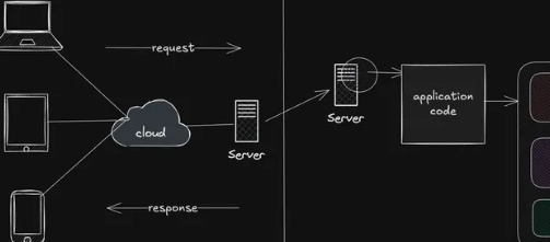
Web Application Architecture: Client-Server, MVC & Layered Architecture
Understand how web applications are structured using client-server architecture, MVC, layered architecture, and related patterns, and learn when each approach is useful.

Web Application Deployment: Vercel, Render, Docker & Cloud
Learn how to take web applications from local development to production using platforms like Vercel and Render, containerization with Docker, and modern cloud deployment platforms.

Version Control with Git & GitHub
Learn how developers track code changes, manage branches, collaborate, resolve conflicts, and maintain projects using Git and GitHub.

JavaScript Package Management: npm, pnpm & Yarn
Understand how JavaScript package managers handle dependencies, scripts, lockfiles, versions, and project environments using npm, pnpm, and Yarn.